
Homie is a smart bedroom automation system - comprising of a primary hub and supporting mobile application - designed for the modern Indian household. It enables users to effortlessly automate and control appliances and components in their room, simplifying daily routines while saving time and energy.
Role
Researcher,
Product Designer,
Visual Designer
Timeline
4 weeks
+some extra refinement
Collaborators
Adithya Krishna
Vaibhav Jangid
Anoof P K
Me!

The Brief
Design a bedroom automation system with a wall-mounted controller that could be retrofitted into a typical Indian middle-class bedroom — one simple enough to feel like a fan regulator, not a smart-home dashboard.*
*Designed as part of a 3 week Interaction Design Course at IIT Bombay
Research
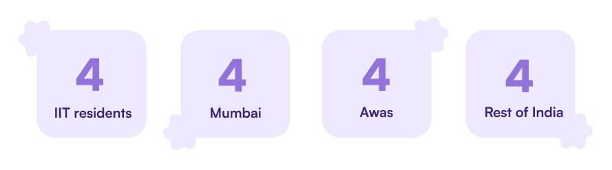
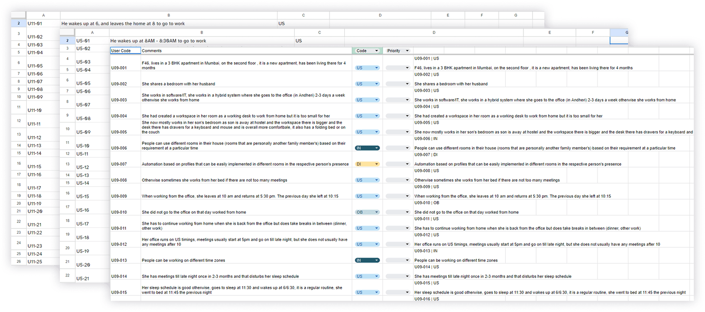
We interviewed 16 users across varied demographics, spanning ages 17 to 50+, covering routines, temperature habits, external annoyances (weather, insects, even monkeys and birds), and how people actually use their devices day to day. Everything was transcribed, synthesized as a team through bottom-up affinity mapping to find real patterns.


We also built physical work models - detailed floor-plan mappings of real bedrooms - tracking components, appliances, switchboards, lighting, A/C, window/curtain behavior, and plug points. This is where we found friction most smart-home products miss: a single switchboard controlling multiple heavy appliances, a desk built for work that went unused because it wasn't clear to the user.

Insights
Key insights shaped everything downstream: people improvise workarounds when switches are hard to reach; shared rooms create real conflicts over control (not just preference — negotiation); people are cost-conscious in principle but ignore it in daily usage habits; and — critically — existing smart-home products often have limitations that demotivate people from using them at all. That last one became a guiding constraint: don't build something powerful that people give up on.
Research led us to sharpen the brief
To design an equitable system, affordable for modern Indian families, prioritizing comfort, ease of use, safety and accessibility over feature breadth.
Before designing screens, we used the Usability Goal Setting Tool (Prof. Anirudha Joshi) to define what "good" meant concretely: users should be able to set up in under 10 minutes on their first or second attempt; navigate quickly; and never lose track of the system's conceptual model. Information had to be well-presented.
How the System holds together
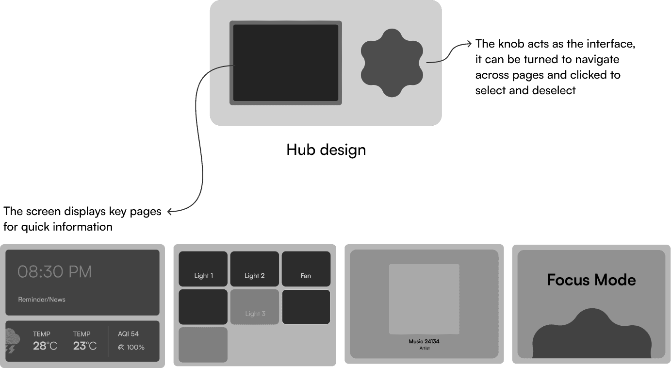
That grounding pushed us toward a clear stance: the hub is the primary interface, not the app that acts as an orchestrating brain. The hub is simple, physical, always-on; the app is scoped to setup, advanced settings and as a secondary remote.

The hub's main gesture is a large knob — rotate to navigate, press to select, double-press to exit — deliberately closer to a fan regulator than a touchscreen menu.
Visual Identity
The product's identity is a word-mark and an iconic logo-mark in the design of the knob. Purple was chosen for its soothing secondary notes and give the product a premium yet playful feel. We wanted the design to stand out and be something that people want to keep in their rooms.

Validation
We explored plants and a Tamagotchi-style pet before landing on a fish companion, tying naturally into "school" and ocean imagery that matched the name MerMind. That metaphor carries through the whole UI: mood states expressed through the fish's color and expression, soft gradients, and a card-based layout that keeps a heavy subject feeling light to navigate.
The Product
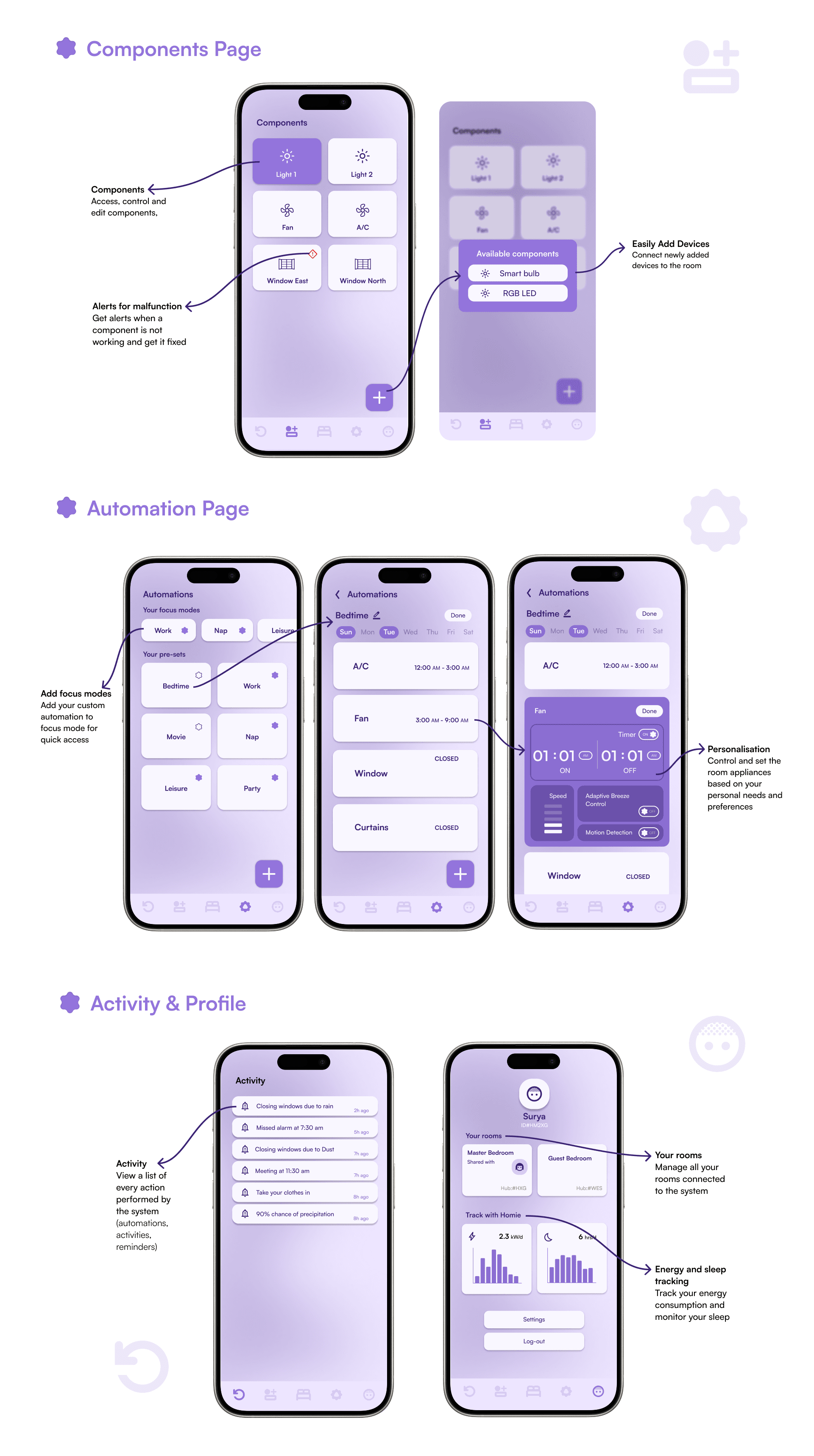
The final system comprises a hub that can be wall-mounted or placed bedside (standby screen, focus-mode switching, music playback with album art, device status) and a companion app (room overview, automation builder, activity log, energy/sleep tracking) — plus onboarding flows for both.



What next?
Given the time, I would love to build a framework for how the entire system operates and expand on how it would handle automation. Multimodal inputs such as voice and gesture, as well as sensor based detections are also on my list. I still do think about this project and jot down new ideas whenever I think of one.